In two previous articles, I described examples of data visualisations for types of outcomes and impacts that are often reported in Monitoring & Evaluation (M&E) reports, one more general and one specifically on visualising survey outcomes. Visualising data in M&E reports can help to better understand the data, can increase engagement of stakeholders, and improves the overall readability of the M&E report.
Here I will share some data visualisations specifically for satisfaction ratings which are common for M&E projects. I provide some examples of charts that can be used for this purpose, but of course which type of visualisation best fits depends on the type of data and the information you want to convey. Generally, it is a good practice not to try to put too much information into one graph or figure and to include a clear descriptive title for all data visualisations. A conclusion of the data as a descriptive title can help ensure that the data and visualisations are not misinterpreted. I also recommend to stick to one colour or colour palette throughout the M&E report so that it does not distract from the information you want to convey.
On a more general note, whenever presenting data, it is important to include information about how many data points were collected and a description of the methods used to collect the data. If the sample size is very small it can be misleading to show percentages in data visualisations. It may also be necessary to provide a breakdown of specific groups within the data, for instance women and men or different ethnic or age groups.
As in my previous articles on data visualisations for M&E reports, all graphs below have been made using Python, Matplotlib and Seaborn. All data is fictitious.
Visualising satisfaction ratings: horizontal stacked bar graph
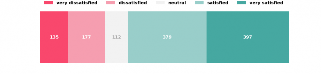
Surveys often contain questions asking stakeholders of a project to express their satisfaction with a program, training or any kind of intervention. Satisfaction is usually scored on a Likert scale, often a 5-point scale ranging from very dissatisfied to very satisfied. While it can be helpful to mention an average satisfaction score, this score does not convey much information about the distribution of scores. It can therefore be helpful to show how many survey participants are in each answer category as for example shown in figure 1 which shows the satisfaction of a total of 1200 participants with a training provided during a project.
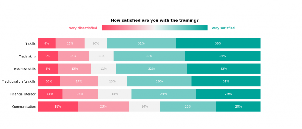
When comparing satisfaction ratings across different groups, for instance different age groups or when comparing the satisfaction with different trainings, multiple stacked bar graphs would be most suitable as shown in figure 2. Note that while the number of participants per answer category is shown in figure 1, figure 2 shows the percentage of participants per answer category because the total number of people who participated in each of the trainings differs.
Visualising satisfaction ratings over time: line graph
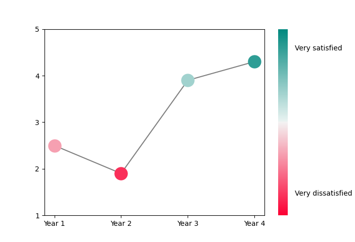
If the data come from multiple surveys collected over a period of time, it may be interesting to show how satisfaction ratings have changed over time. Figure 3 shows a line graph with the average satisfaction ratings for the training over the 4 years of the project. It can be clearly seen that the average satisfaction with the training decreased in Year 2 and then increased in Years 3 and 4.
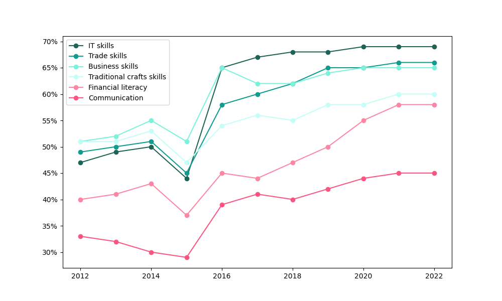
A line graph can also be used to compare different groups’ satisfaction ratings over time. Figure 4 shows the percentage of participants who were satisfied or very satisfied with the different trainings over a 10 year period. Note that participants who answered “neutral” or who were dissatisfied or very dissatisfied are not shown in this figure. As can be seen in the figure, overall satisfaction ratings increased over time with a dip in 2015. Overall, fewer participants were satisfied or very satisfied with the Financial literacy and Communication trainings.